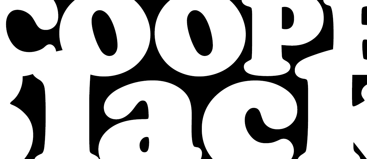
Cooper Black

There are a few font faces in my font menu that I have largely ignored for my entire career. Fonts that many designers consider too stylized, too old-fashioned, or just a plain joke to use in a modern era.
Hobo, Papyrus, Cooper Black…
Occasionally, I made a game of trying to figure out how to sneak these fonts into projects — just for the sake of saying that I pulled it off.
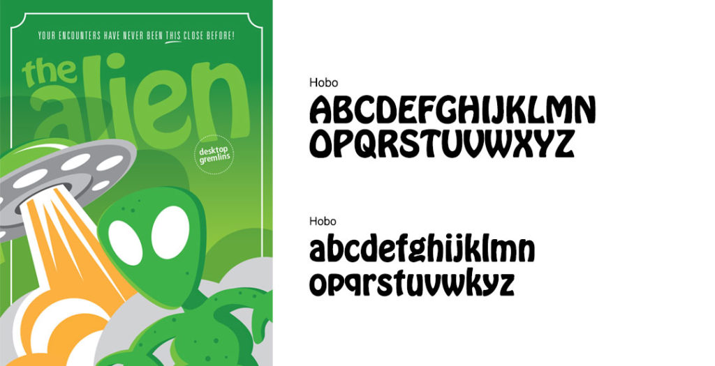
I successfully wormed Hobo into one of my paper craft book designs that also featured an alien. A fascinating combination that totally worked (but only when I used the lower case letterforms).

I have NEVER used Papyrus. Many people consider its use one the original sins of graphic design — it’s only for newbies! (Imagine my surprise when the font was successfully tweaked to market one of the biggest movies of all time – AVATAR.)
And then there’s Cooper Black.
Cooper Black is a font I have largely ignored because it seemed sort of stale and boring! Sure, it has some nice details, but I can’t imagine anyone actually using it in a professional design space.
And yet, this font is a powerhouse and it has been used EVERYWHERE! I just needed to open my eyes and recognize it!
I found this amazing video about Cooper Black by Vox and it is just too wonderful not to share. So sit back, relax, and discover the fascinating history of Cooper Black (while I sit here and try to figure out a way to incorporate this font in my next packaging design project).
Was this article helpful? Share!
“There’s a typeface that has made a resurgence in the last couple of years. It’s appeared on hip hop album covers, food packaging, and advertising. Perhaps you know it from the Garfield comics, Tootsie Roll logo, or the Pet Sounds album cover by the Beach Boys. It’s called Cooper Black, and its popularity and ubiquity has never waned in the hundred years since it was first designed.” –Vox


